Extract UI Items
Liquid Templating Page

User Interface Discussion
I like how the highlighter effect used on "{{ variable }}" has a sunken in effect.
This effect was achieved by using a darker background color, a border radius, and inset box shadow.
Resources Page

User Interface Discussion
I like the stylization of the blockquote in this list.
To achieve this effect the font size was decreased and the style was italicized.
News Page

User Interface Discussion
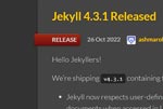
I like the way that the "RELEASE" ribbon wraps around the edge of the article section.
The ribbon was created with display: inline-block; with a 5px border radius on the right 2 corners and a lower box shadow. The piece that wraps around is a separate element that I am not quite sure how they achieved.
Home Page

User Interface Discussion
I like the way the Quick-start Instructions are presented over the other background elements.
The box was presented in front of the other elements using a block display with a float.